Published: Aug 15, 2022Time to read: 8mins Category: Insights
8 Data Visualizations Available With PeopleFluent Performance, Compensation, and Succession
When you’re making business proposals, you need to have evidence to support your objectives. The thing is, not all business leaders are data savvy. Since you likely won’t know the level of background knowledge in your audience, it’s important to provide facts in a manner that is easily understandable.
Visualizations are an effective tool for presenting complex data. Staring at rows and rows of numeric data can be daunting. When your performance, compensation, and succession tracking software are enhanced with analytics, you’ll have the ability to configure your employee data into an array of charts and graphs that make digesting the information easier.
Below, we’ve outlined our most advanced data visualizations, all of which are available with PeopleFluent Performance, PeopleFluent Compensation, and PeopleFluent Succession.
1) Breakdowns
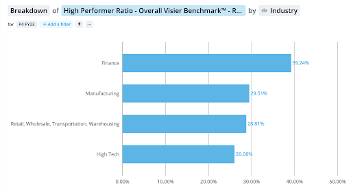
Breakdown visualizations present a horizontal bar graph comparing a specific measure across a series of groups. HR leaders love this graph because it provides a quick overview of the chosen data while being easy to digest. There are many possible ways to deconstruct your data—so get creative!
For example, breakdowns can be used to see performance distribution across the workforce. This can be sorted by department and allows managers and other business leaders to quickly see the distribution of performance ratings. The data midpoint represents the bulk of employees and gives business leaders a quick visual assessment of where the majority of workers fall.
Managers can use that information to make decisions about how to provide appropriate support for their employees and ensure that everyone is able to achieve success together.
2) Trends
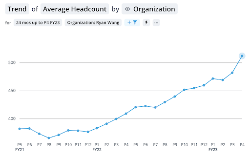
Trend data is crucial to future planning. Your organization needs to understand past and current trends in its operations in order to make decisions for the future that are likely to have the most positive impact. A line graph—as shown above—can depict changes in metrics over time. It’s useful for exploring specific data points and identifying patterns that develop within your organization.
One way organizations can take advantage of this visualization is to use it to help close pay gaps. Business leaders can filter their data based on specific groups and check for pay discrepancies in comparison with other groups within the organization.
For example, business leaders can compare pay trends between men and women and can track their organization’s efforts to close any existing pay gaps over time. The information is useful for any businesses working on their diversity, equity, and inclusion efforts.
READ MORE | ‘How to Leverage Technology to Drive a Productive and Engaged Workforce’
3) Trend Breakdown
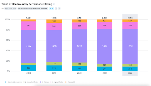
You can take things a step further with trend breakdowns. This bar graph format plots your data points over time. It allows you to compare groups while simultaneously emphasizing the magnitude of a change through a certain period. It’s a great way to visualize the impact certain practices can have on your organization.
Take the pay gaps example from above. Trend breakdowns allow organizations to drill further down and see how business practices impact smaller groups that exist within a larger group. An organization that is working to close pay gaps between men and women can use this data visualization to see how women of different backgrounds and groups compare with one another.
All of these data points can be used to assist business leaders in making decisions for the overall betterment of their workforce and organization.
4) Data Tables
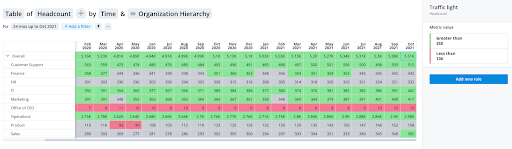
Sometimes you’ll need to have all of the numbers mapped out, either for yourself or for other inquisitive minds when you’re presenting results to board members. Data tables outline all of your metrics in easy-to-read columns and rows. Whether you’re using performance, compensation, or succession data points, you’re able to organize your information according to your specifications. This way, you’re only viewing the numbers that are important to your task.
Data tables can show organizational leaders the breakdown of performance ratings according to various identifiers, such as gender or minority group. Leaders can also choose to include data on merit pay increases or short-term bonuses and indicate the percentage of increases or pay for departments, genders, specific positions—and more!
Basically, these tables can be highly customized to meet an organization’s changing needs, so decision-makers see what they need to move the business forward.
5) Bubble Grids
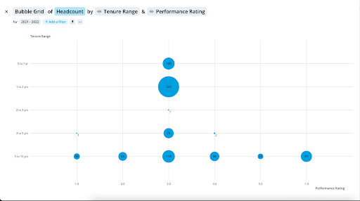
Bubble grids make it possible to display three dimensions of data. In the example above a bubble grid has been created plotting the number of employees who fall into certain tenure ranges and performance grade intervals.
In this type of graph, in addition to the typical charting of values along the X and Y axis, we also see that bubble sizes reflect the population of each grouping. So in the example above we can see that the largest group are employees who have a performance rating of 3.0 and have been in their role for between 1 and 2 years. This can quickly show organizational leaders achievement trends in the employee lifecycle, allowing them to better interrogate it—does high achievement drop off at a certain point? Does exceptional performance only happen a few years in?
Another way of using bubble grids could be to plot the number of employees by salary and tenure. Such information could help organizations spot situations in which newer employees are being paid at a higher rate than employees who’ve been with the company longer.
MORE ON DATA | ‘Visualizations and Metrics That HR Leaders Love’
6) Movement Breakdown
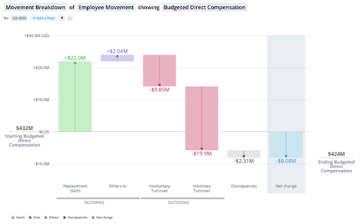
It’s important for organizations to be aware of employee movement within the business. Movement breakdown charts show changes in employee movements over a period of time. Employee movements are broken down by individual components, such as starts, exits, and individual stages in the employee lifecycle. The data helps leaders visualize how employee movement positively or negatively contributes to the net change within a company.
Movement breakdown charts are a helpful way to visualize why employees are joining or leaving the organization. When an organization goes through a large change, such as an acquisition or expansion, movement breakdown charts help leaders determine if their overall headcount has increased, decreased, or remained the same. When a company’s headcount stays the same after a large organizational change, the movement breakdown chart can also help leaders understand whether large numbers of people voluntarily resign and are replaced with new hires.
This information can prompt leaders to review business practices and needs. For instance, if there was a large increase in headcount due to an acquisition, then the organization will likely need to look at its onboarding process, as well as review its compensation in comparison to the rest of the organization for alignment.
In the case of an organization that experiences a large number of voluntary resignations, leaders might be prompted to investigate why employees chose to leave and how the organization can better retain employees. Information from the movement breakdown chart gives organizations the opportunity to investigate internally and work to improve their practices.
7) Movement Summary
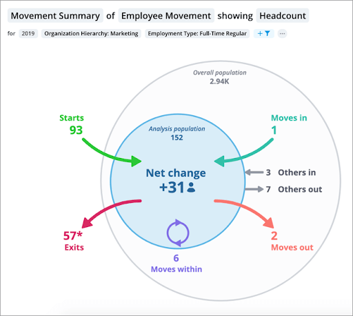
The movement summary chart shows business leaders employee movements into, out of, and within a specific analysis population during a selected time period. Leaders can use this chart to see which employees are moving in and out of the analysis population and how that movement will impact the rest of the population.
This visualization can assist leaders with succession planning efforts. Leaders can see whether a lot of people from a population are leaving or what kinds of movements are happening within the organization. This data can help HR leaders and managers choose a starting point when developing their succession plans or refocus their planning efforts if new trends emerge.
8) Drivers
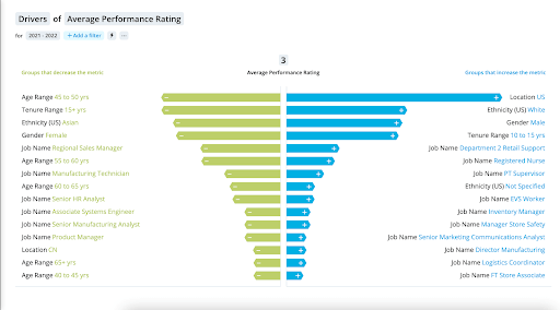
It’s important to be aware of which employee groups are significantly impacting the data you’re reviewing. The drivers chart helps leaders identify the employee groups that require more of their attention. This chart highlights which groupings have a positive or negative effect on any given metric, so managers and other business leaders can take steps to address the needs of the employees in these outlier groups and continue to work toward reaching the organization’s goals.
For example, if the organization is looking at employees with a low-performance rating, and the chart shows that one of the largest drivers is a certain department in the organization, then a further review should be done to determine why that department has so many low performers. The organization can then determine if the issue lies with the employees themselves or within that department’s leadership team and take appropriate action to solve the problem.
The drivers chart can also be used to help assess compensation practices. For example, if a specific gender or ethnicity is a driver for a lower compensation ratio or a lower average pay increase, then this should prompt organizations to review their compensation practices to ensure that compensation is equitable.
Make Understanding Easier for Your Audience With Visual Data
You can’t make important business decisions without having knowledge and evidence to support your choices. Visual data tables and charts make it easier for you to present your ideas to your audience in a manner that’s easy to understand. Some of your audience might not be data savvy, but a visual representation of complex data points can help you explain the “why” behind important organizational decisions that can help your business continue to grow.
MORE FROM THE BLOG | ‘5 Questions That Get to the Heart of Why People Analytics Matters’
See What Else Data Visualization Can Do for You
Discover the power of data analytics with PeopleFluent Performance, Compensation, and Succession. Contact our sales team, or request a demo today!
